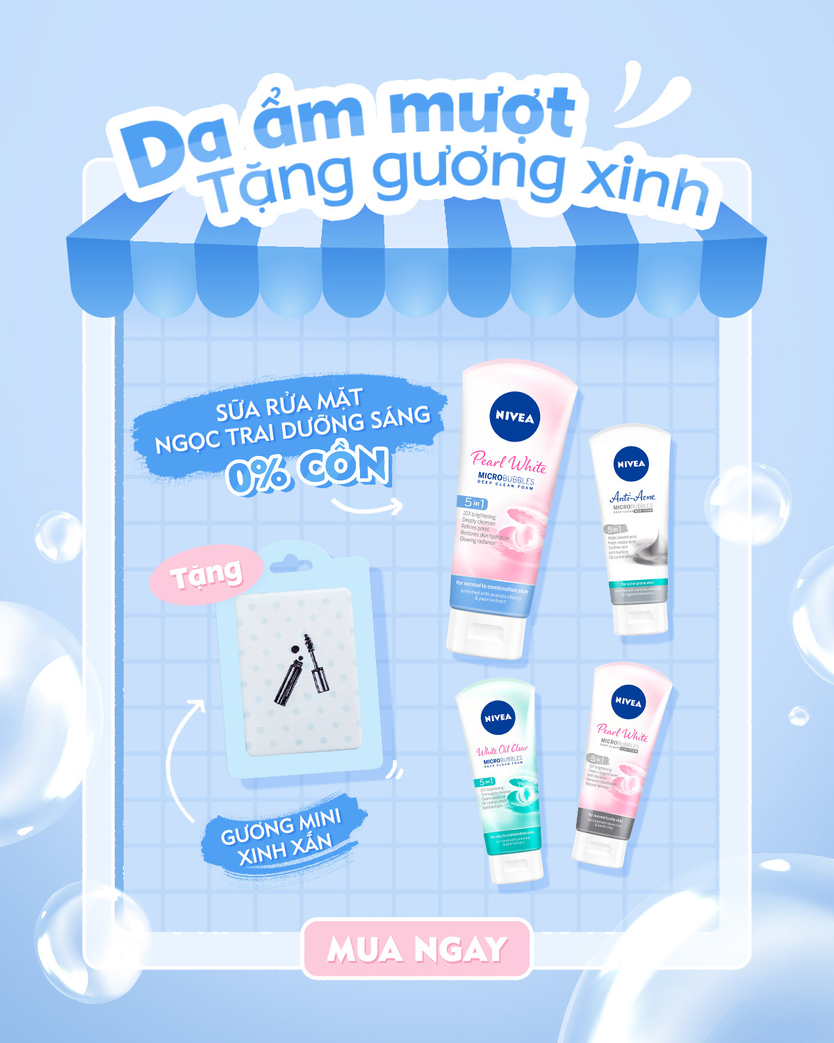
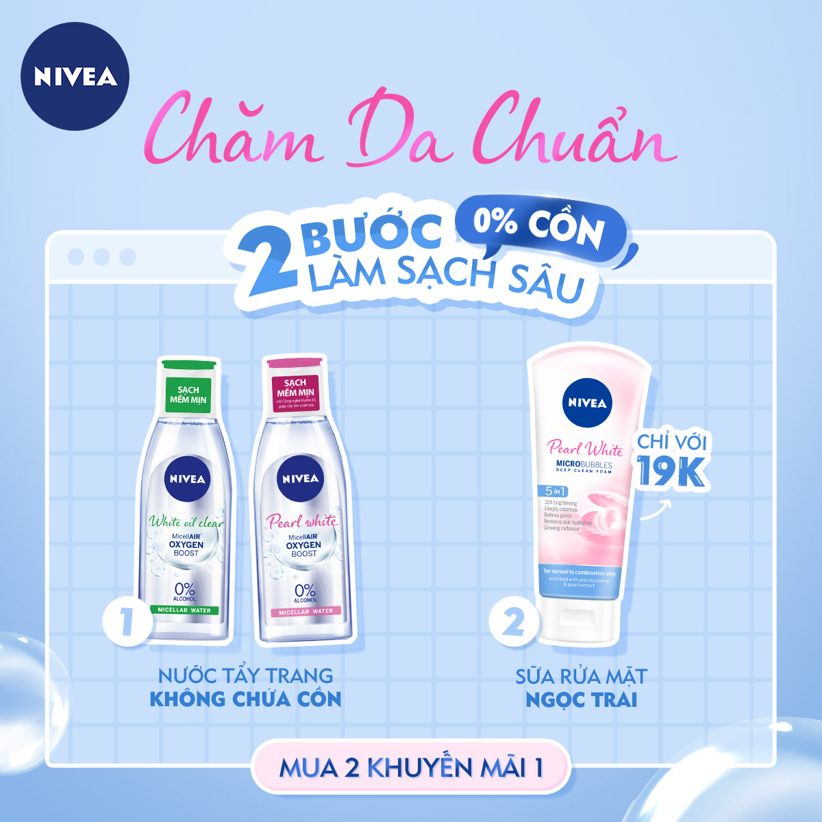
As one of my first beauty brands, in this project I learn how to make aesthetically pleasing elements work well with the branding side of the product while avoiding cliche visuals.
When I come up with a new blue color for the visuals, It seems to be a "refresh" button to the fan page. However, later on the clients gradually love the change of the overall mood & tone and bring many of the social work into other assets.
Nivea Pearl White
Client: Nivea
ACD: Raven Ngô
Graphic Designer: Thạch Phát, Thy Nguyễn
Copywriter: Thu Nga


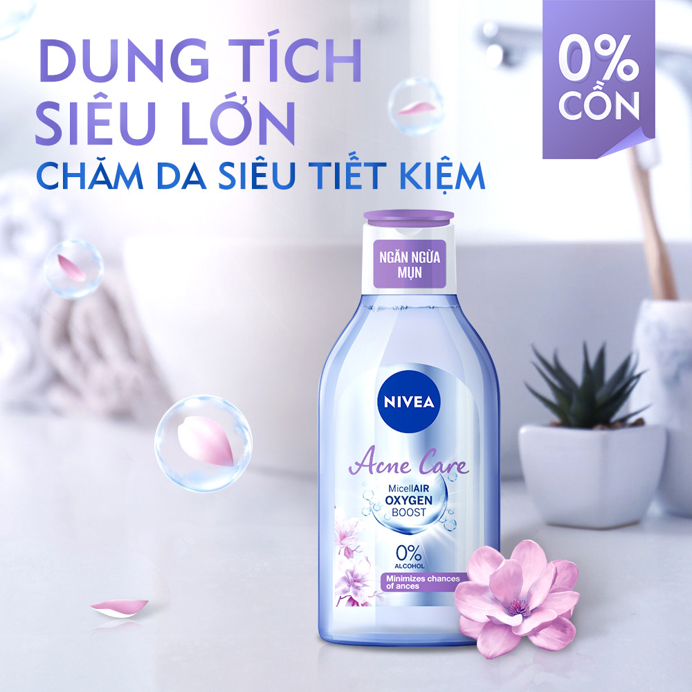
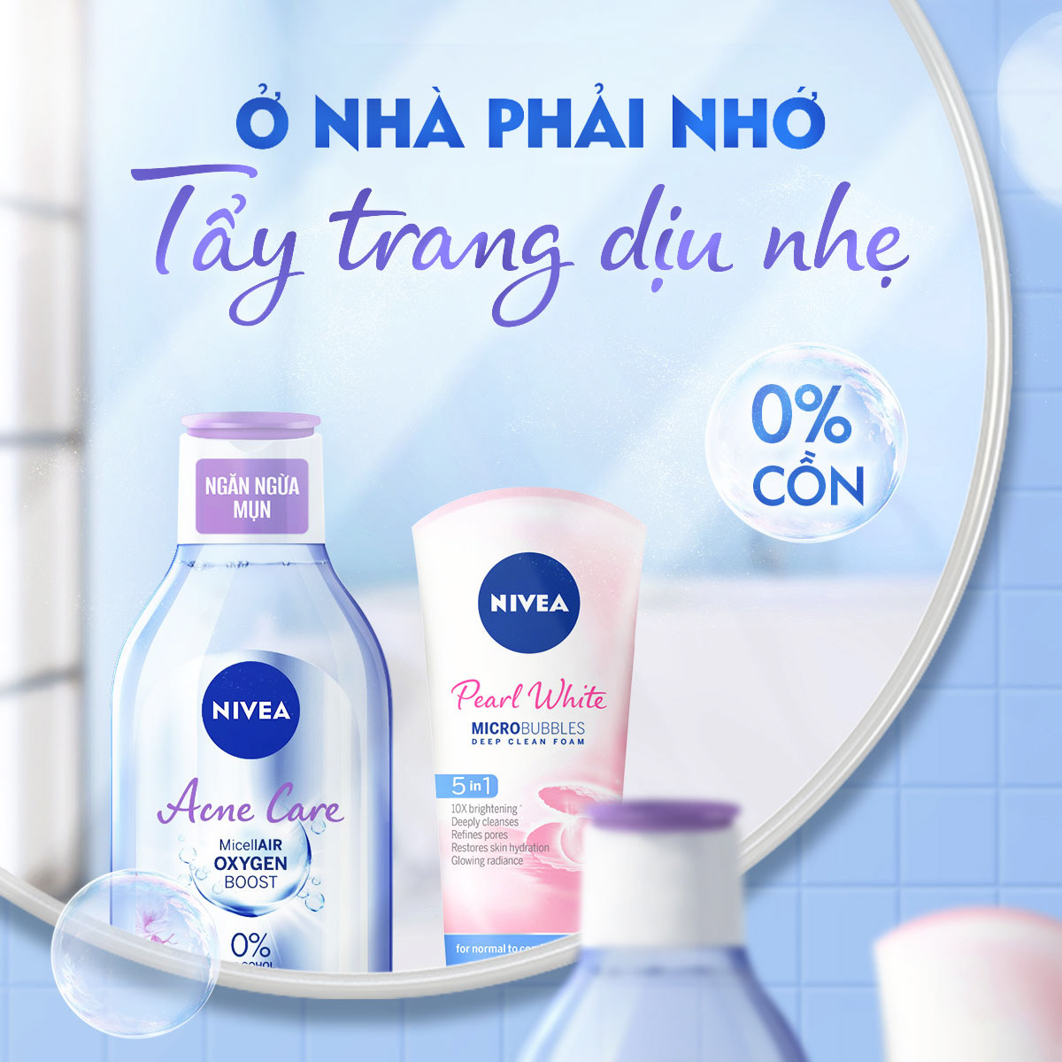
Nivea Micellair Oxygen Boost
Client: Nivea
ACD: Raven Ngô
Graphic Designer: Thạch Phát
Copywriter: Thu Nga
Account: Trinh Phạm


THANK YOU
2021
